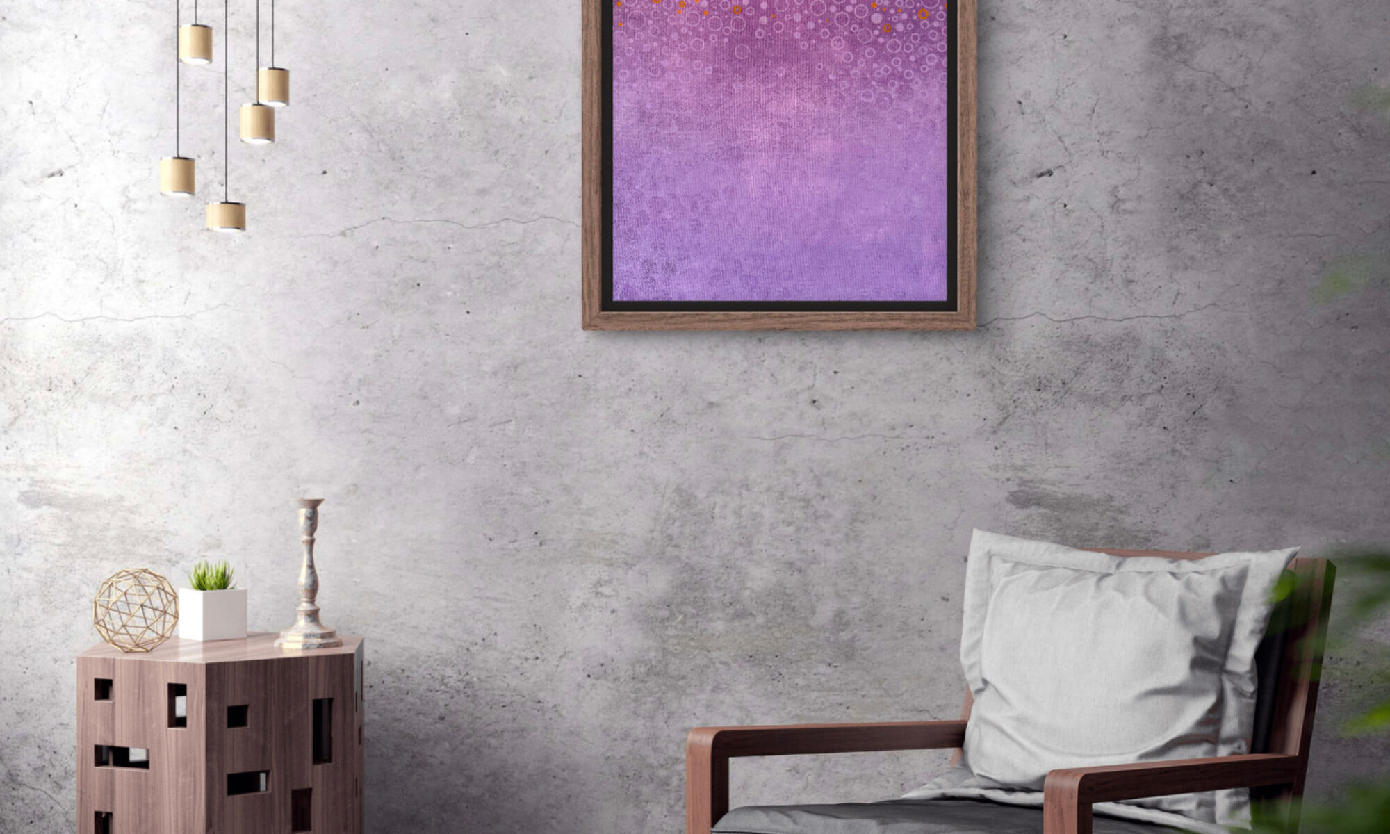
Death Never Stops

A fish constructed from bold colors and transparent skeletal form defies expectations while revealing unity. Where rich purple bones encounter the bright orange body, two aspects converge. On the left, muted blues and soft textures suggest a layered quality, while the right introduces structured polka dots against a lighter blue, conveying playfulness and order. Light and color merge effectively, with shadows and highlights enhancing contrast. As future viewers experience this contrast, will they perceive a metaphor for transformation or a playful exploration of form and color? This depiction invites ongoing discoveries and connections.

A continuation of the series of Changes, this piece is titled Death Never Stops refereeing to how all living beings will eventually face death. There is no place to run or hide from Death.

Changes IV

Emerging as a center of cultural discourse, this creation charms with its complex arrangement of lozenge shapes cascading from warm caramel into cool olive tones. The repeating patterns reflect motifs often found in decorative designs, while the rich violet overlay disrupts and tantalizes the viewer’s perception. This delicate arrangement of color and form aligns with themes of continuity and change, suggesting broader societal narratives. How might this fusion of textures and hues prompt a new lens through which to view the world? This piece encourages consideration of the blend of tradition and modernity, portraying the essence of transformation within a structured cosmos.

Emerging as a center of cultural discourse, this creation charms with its complex arrangement of lozenge shapes cascading from warm caramel into cool olive tones. The repeating patterns reflect motifs often found in decorative designs, while the rich violet overlay disrupts and tantalizes the viewer’s perception. This delicate arrangement of color and form aligns with themes of continuity and change, suggesting broader societal narratives. How might this fusion of textures and hues prompt a new lens through which to view the world? This piece encourages consideration of the blend of tradition and modernity, portraying the essence of transformation within a structured cosmos.

Changes III

Changes III

A cascade of geometric shapes seemingly drift from the top, transitioning from turquoise to a warm golden hue. The careful arrangement of these squares creates a gradient effect against a rich maroon backdrop, suggesting gradual transformation. Viewers may question the tension and balance within this structured chaos, as it defies typical symmetrical order. This composition challenges perceptions, allowing for an appraisal of both its precision and disorder. The result is a visually tactile experience, where a relationship of color and form gently unfolds, enveloping observers in the complexity of its design.

Are you blind that you can’t see the difference?

“Are you blind that you can’t see the difference?” “Estas ciego que no puedes ver la diferencia?”

This piece was inspired by an episode of Star Trek that I saw back in the 1970s. The episode is The Last Battlefield S3 #15.  It dealt with a planet in which the citizens had been at war with each other for thousands of years. The difference apparently was which side of the face was black and which was white.  This show left a lasting impression on me.  And here we are more than 50 years later and it seems that nothing has changed.  We as a nation seem to still be in conflict with each other and any new immigrants. 

The painting is trying to bring attention, as the show that inspired it to how much we are alike and deep down we are all looking and dreaming the same things.  Only superficial differences is what makes us feel we are different.

"Are you blind that you can't see the difference?"

This piece was inspired by an episode of Star Trek that I saw back in the 1970s. The episode is The Last Battlefield S3 #15.  It dealt with a planet in which the citizens had been at war with each other for thousands of years. The difference apparently was which side of the face was black and which was white.  This show left a lasting impression on me.  And here we are more than 50 years later and it seems that nothing has changed.  We as a nation seem to still be in conflict with each other and any new immigrants. 

The painting is trying to bring attention, as the show that inspired it to how much we are alike and deep down we are all looking and dreaming the same things.  Only superficial differences is what makes us feel we are different.

Colorado Beauties

A vivid and colorful piece of contemporary art depicts three bright blue butterflies positioned against a backdrop that combines a yellow checkered grid with a patchwork of small, irregularly-shaped blue and yellow squares. Additional decorative elements, including red, yellow, and blue circles and dots, are interspersed throughout the composition. The title of the piece, "Colorado Beauties," suggest it is an acrylic painting on canvas and evokes a sense of freedom, serenity, and hopeful possibility through its dynamic color scheme and the symbolic representation of butterflies.

Colorado Beauties

A vivid and colorful piece of contemporary art depicts three bright blue butterflies positioned against a backdrop that combines a yellow checkered grid with a patchwork of small, irregularly-shaped blue and yellow squares. Additional decorative elements, including red, yellow, and blue circles and dots, are interspersed throughout the composition. The title of the piece, “Colorado Beauties,” suggest it is an acrylic painting on canvas and evokes a sense of freedom, serenity, and hopeful possibility through its dynamic color scheme and the symbolic representation of butterflies.

16″x20″ Acrylic on Canvas

2024

$450.00

Available @Artrepreneur.com

@copyrighted

#cubanart #pintura #butterfly #contemporary art

Le Jardin de Meduse

Le Jardin de Meduse

an image of Meduse by artist Jorge R Gonzalez
The image is of a painting portraying a red-haired woman with blue eyes who is wearing a green top. Adornments such as a purple-beaded necklace and flowers in her hair, with the flowers mainly being blue with red centers, are also depicted. The image does not depict any textual elements.

Le Jardin de Meduse

A slight change of direction with this piece, working on a more figurative style. More of an experimentation and trying out new waters.

The image is of a painting portraying a red-haired woman with blue eyes who is wearing a green top. Adornments such as a purple-beaded necklace and flowers in her hair, with the flowers mainly being blue with red centers, are also depicted. The image does not depict any textual elements.

Majors in the Rain

Major Mitchell Cockatoos from Australia

In this piece I have included Major Mitchell Cockatoos from Australia, Rainbow Eucalyptus Trees and Tulips. This is one of the paintings that is part of a series that I’m working on dealing with vanishing ecosystems and the animals that live in it. I’m using less common animals, which tend be less “loved” to highlight that all of God’s creation serves a purpose. The series up to the moment includes this piece “Majors in the Rain”, “Don’t Get Triggered By The Goggle Eyes”, “Red on Yellow Kill a Fellow”, “Bleached”, “Una Morena y Sus Amigas”, “Flounder and Friends”, “Bycatch”, “Gulf Stream Life”, “Sunset at the Pond”, “Hierba de Alacran” and “Una Cascabel y Sus Peyotes”.

Purchase the Artwork here: Artrepreneur

Recent work available to purchase on the galleries that represent my work online.

The above image is called “Tidal Pool” 18×24 Acrylic on Canvas. It is inspired by my time in the seashores of the Florida Keys, Key Biscayne, Mattheson Hammock, and Homestead Bayfront Park. Is a continuation of my recent work with dwindling ecosystems and the effects they have on the inhabitants of these environments.

I’m simplifying the forms a bit since I believe my audience has a common knowledge of what many of these marine animals look like. At the same time is not truly important to me doing a ultrarealistic interpretation, that is not my goal I’m more interested in portraying these environments in the most beautiful way possible. This is similar in both design and thought process “Don’t Get Triggered By The Goggle Eyes” Hope you enjoy.

The following galleries are representing my work at the present:

Artrepreneur

Saatchi

Artling

Artmajeur